I finished another painting, a bit similar to the Autumn Leafs painting, but with a much clearer structure and so I think, more powerful.
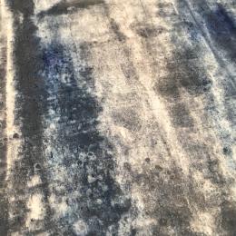
Also, I used different materials: lime, marble powder and cold marble wax for a smooth structure and shellac ink for a warm subtle tone.
This time, I really wanted to get a very deep, strong red. It’s not as easy as you might think by using different shades of red pigments. Red ochre is anhydrous iron oxyde, a mineral. It comes in shades from very dark brown-red to light yellow.
abstract painting
I was very emotional when creating a new painting, thought of my mother, family, life and friends. May be it’s because of November, but I am still very sad about the loss of my mother.
Goodbye At Last
Saying goodbye is never easy
It’s the hardest thing to do
But what hurts even more
Is not the chance to say it to you.Yesterday is just a memory
Our laughter was sunny and bright
Then clouds started to gather
For you were no where in sight.
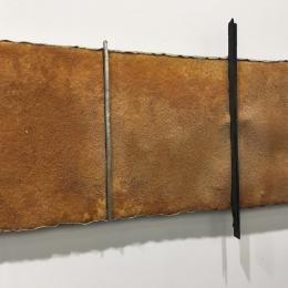
I always experiment with different materials and inspired by some art I saw at the ART Basel, I wanted to create artificial rust on canvas.
There are ready to buy kits for creating artificial rust, which are quite expensive and I thought, also boring to apply. I like to figured it out by myself 🙂
Obviously, I needed some fine metal shavings, which I could get from the local blacksmith. He just shook his head when I told him what I was about, I believe he thinks I am a bit crazy…
The last weeks were packed with lots of stuff. Currently, I am mainly working with Clara & Tobias in this old house and it’s really heavy work. We are still building the new separation wall and we already reached the first level (cave and ground floor are done!).
Autumn, the season between summer and winter, a time of change. It brings beautiful colours of fallen leafs, snugly evenings in front of the fire.
We start preparing for the winter time, harvest and conserve fruits and vegetables from our garden, store firewood, take out our cosy woolen cloths.
Nature is preparing herself for a long rest, to recover, to recharge its batteries for a great comeback next spring.
Autumn also reminds us on the impermanence of life. Maybe a good time to reflect and letting go ?
I am still playing with white pigments while thinking about one’s frame of reference, the overall perceptual, conceptual, affect and action set, which is used to define the self, other people and the world. That set of beliefs has been formed by cultural influences and our conscious and unconscious decision we have been taken:
we see, what we want to see.
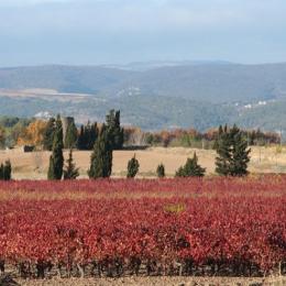
I over-painted bold red pigments with layers of white, until most of the red shines through very thin only.
I abstexperimented with lots of colours and intuitively, I limited myself to shades of maximal two colours in one painting.
In my last paintings I even only used nuances of one colour. This reduction arises from my desire to recognize the essentials, to clear out all the buzz until the core of a thing is visible to me.
It’s a difficult thing with colors, they are for me as complex as emotions and thus a constant challenge to make the essential visible by applying many layers of paint, quite the contrary to analysing something.
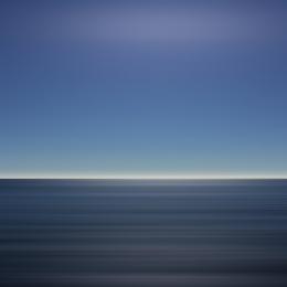
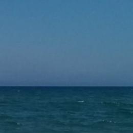
Blue again.
Don’t ask me why.
It’s just about sitting at beach, watching the sea and the sky, listening to the waves, philosophising, dreaming into infinity, sleeping away, waking up refreshed and energised.
It sounds
It rustles
It echoes
It reverberates
It sparkles
It smells
And becomes devoutly singing blue.
The blue fades to light.Hans Arp: Singing Blue
Purple is the subtle intermediate between red and blue, balancing the energetic power and extroversion of red and the calming, analytical blue.
For a long time in human history, it was the colour of the royal dynasties, often associated with mystical phenomenons and worn by catholic bishops. It stands for wisdom, magic and extravagance and is loved by creative people.
When looking in the wardrobe, it seems to be one of my favorite my colours. Those who know me are free to choose from the attributes above why it might be so 😉
While preparing the opening of the ART Fabrik I was also working on two new paintings.
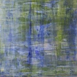
One, a bluish-green combination of different shades of green and blue pigments to create a light, sunny feeling when looking at it. I got inspired by the colours I see when wake up every morning and watch the sky where it meets some almond trees. Unfortunately, I could not take a very good picture of it as it was sold immediately after the opening of our ART Fabrik. The pic above shows it.

